Challenge
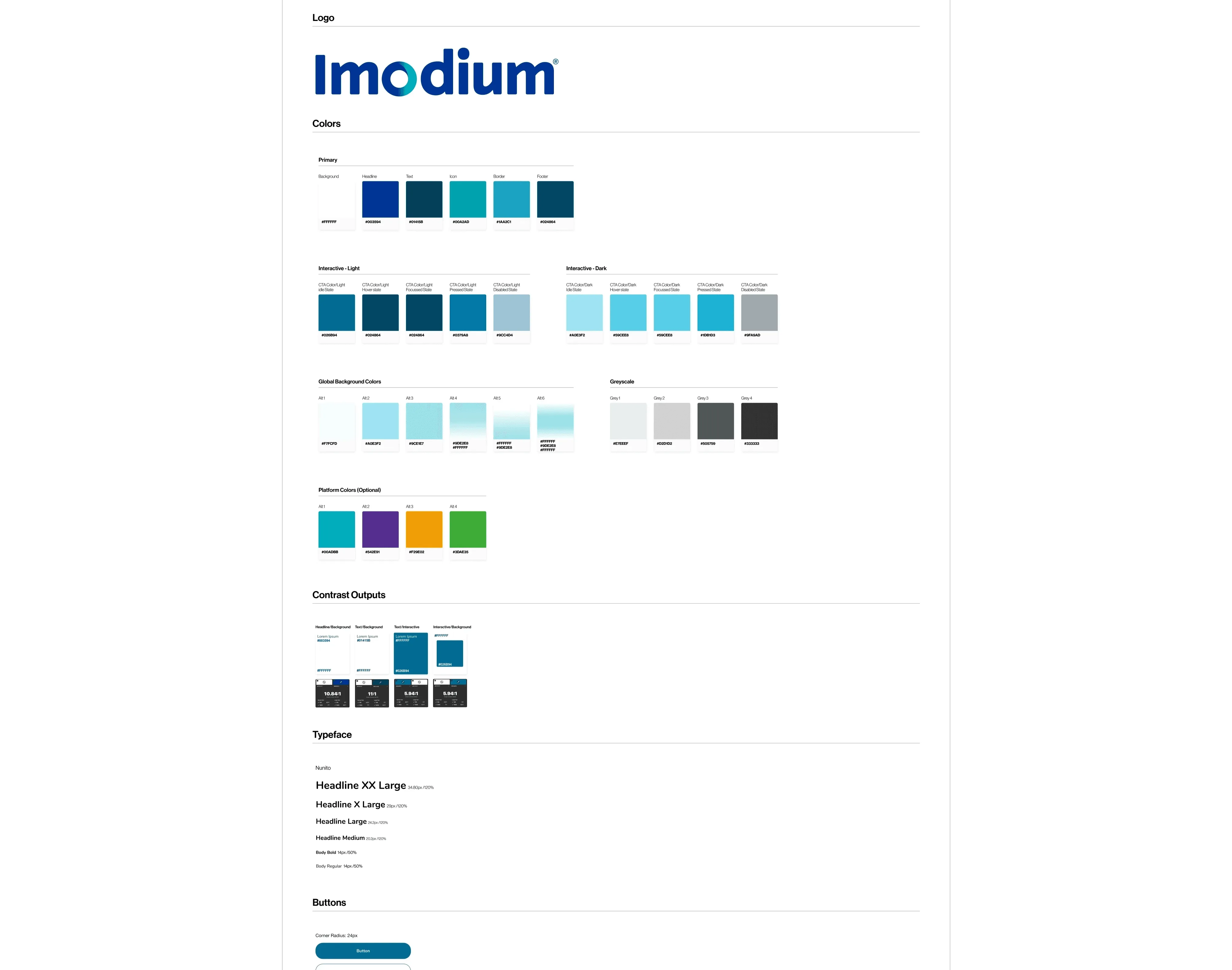
The old Imodium website had outdated visuals, legacy components and an inaccessible palette. The teal brand colour in particular caused contrast problems for calls to action and body text. Moving to the new Digital Experience Platform (DxP) was more than a technical shift: it was a chance to fix long-standing design issues and bring the website in line with Imodium’s packaging and offline branding.
The key challenges were:
- Updating the colour system to meet WCAG AA while keeping the brand recognisable.
- Refreshing typography with new Monotype fonts that scale across languages and screen sizes.
- Reducing the disconnect between sections caused by harsh layout transitions and inconsistent backgrounds.
- Rebalancing colour so teal, more prominent on pack, plays a stronger role on the website.
- Creating a more dynamic, less corporate feel within global design system constraints.
Approach
We used the migration as a strategic moment, not only to rebuild with new components but to rethink how the Imodium brand lives in digital.
- Accessibility-first colour. We tested and adjusted the core palette, especially teal, to meet WCAG AA across backgrounds, text and CTAs.
- Typography upgrade. We introduced new Monotype fonts and tested them across breakpoints with responsive templates and accessibility tools, for clarity and contrast, especially on mobile.
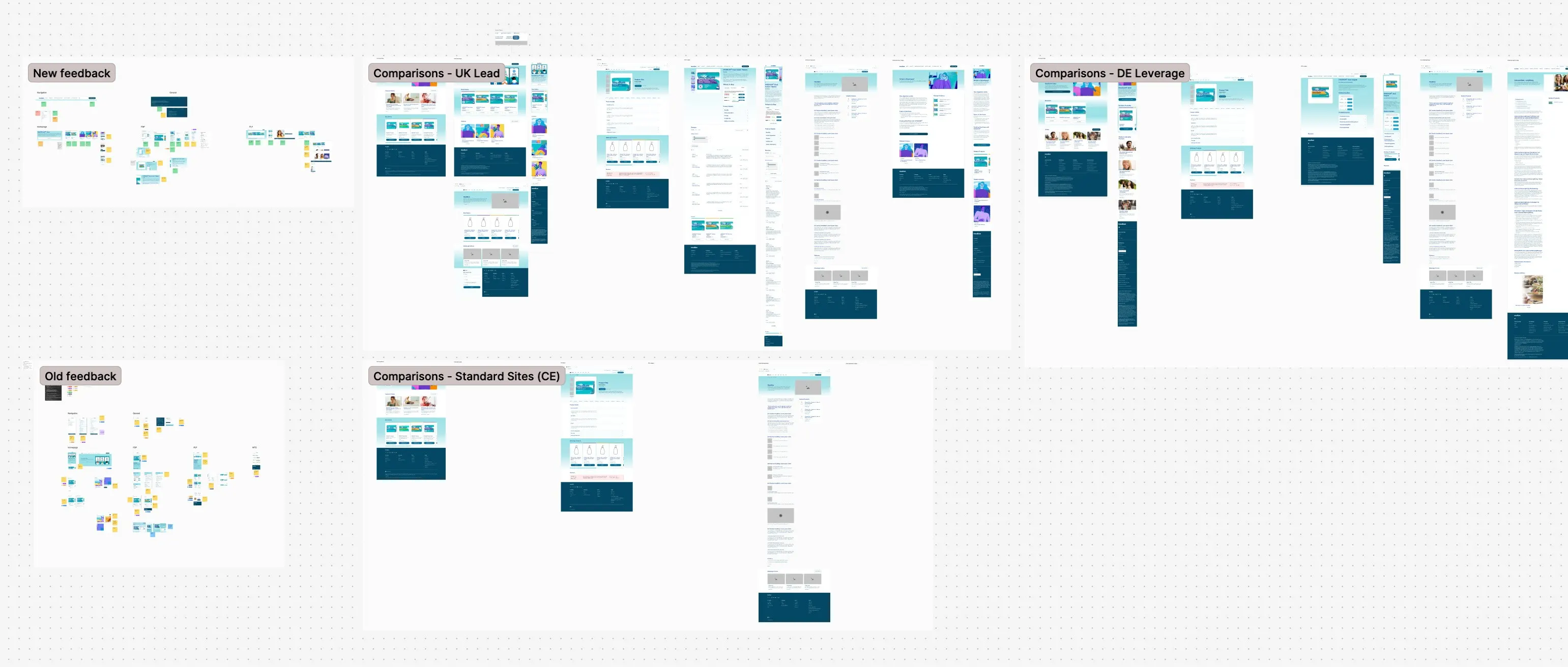
- Component-based redesign. We built with the new Kenvue global design system, aligning page templates and modules with the refreshed identity.
- Visual consistency. We harmonised header, body and footer styles, and added subtler transitions and layered visuals to reduce the “blocky” feel.
- Brand balance. We gave teal more visual weight to reflect the packaging, while keeping Imodium blue for headings and structure.
We applied and tested the designs on key templates from the design system, including the homepage, product detail page and article page. We also checked the component updates on other layouts, such as campaign pages, brand history and where-to-buy pages, for consistency and flexibility across the site.
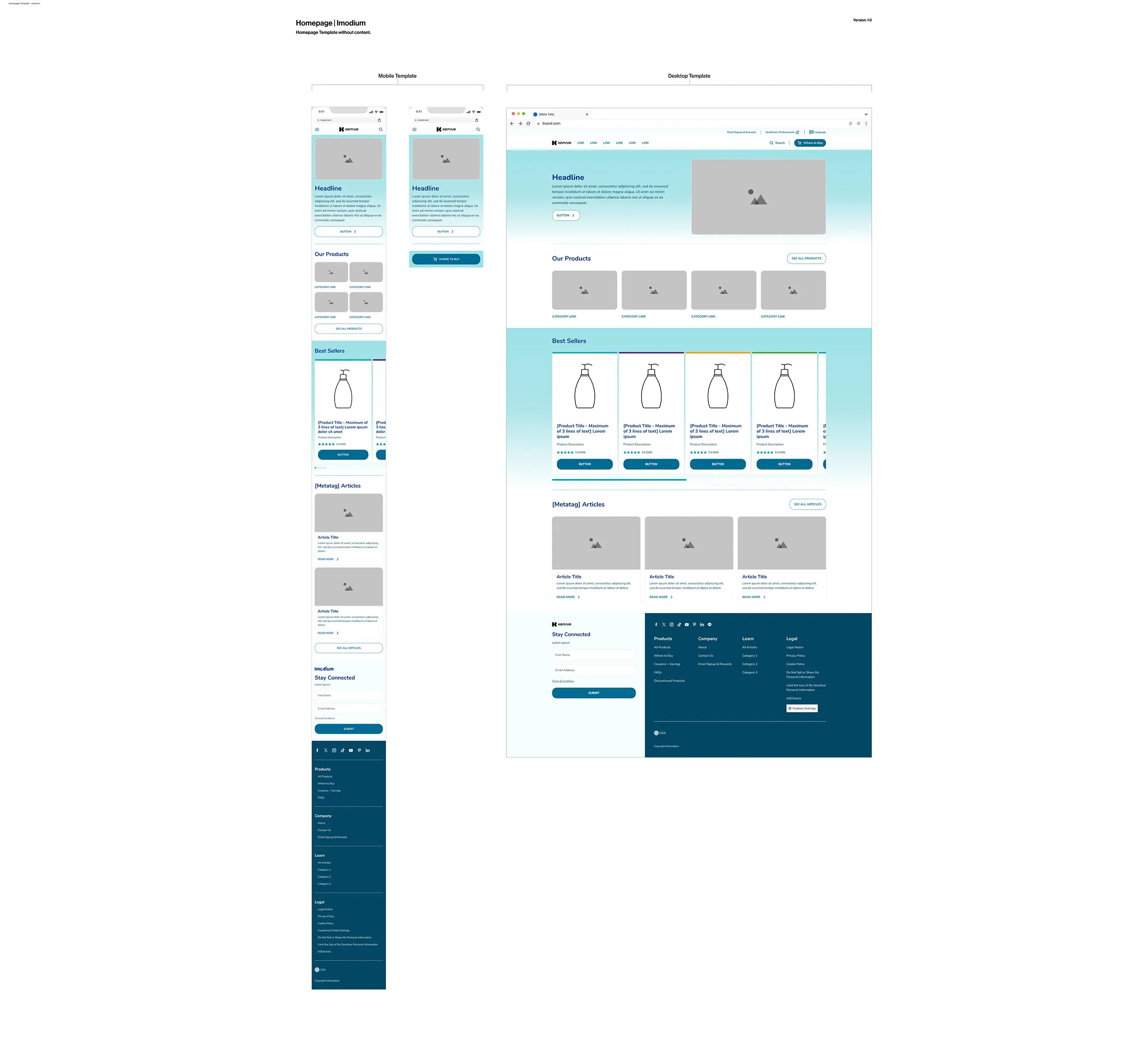
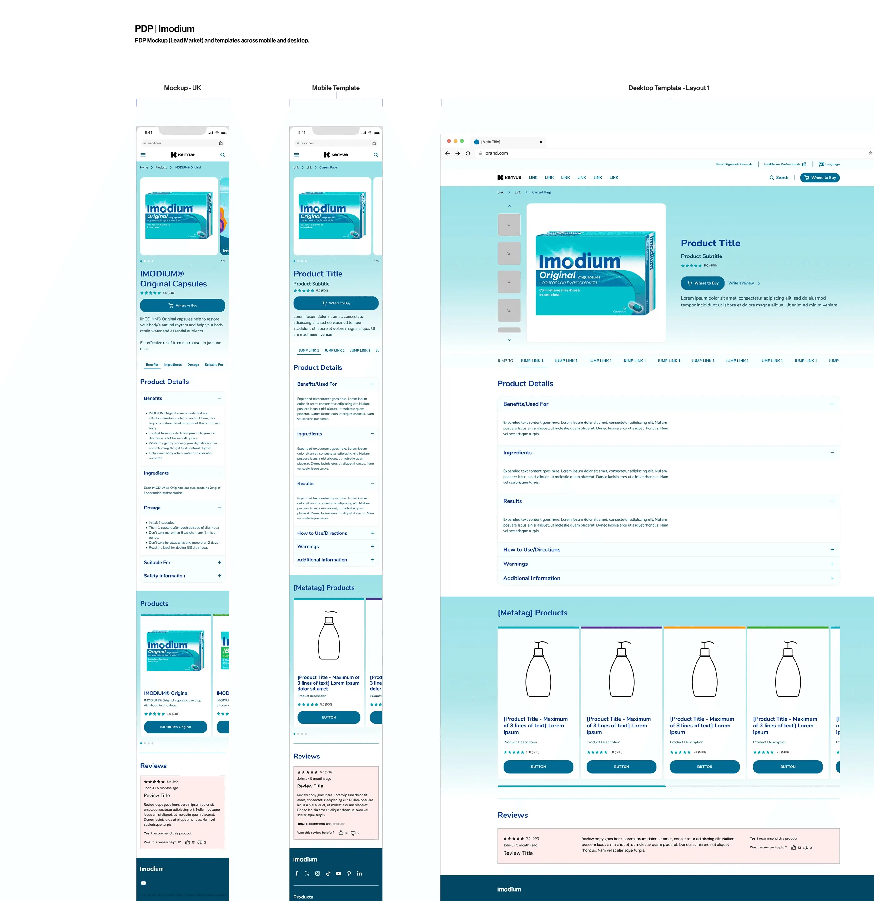
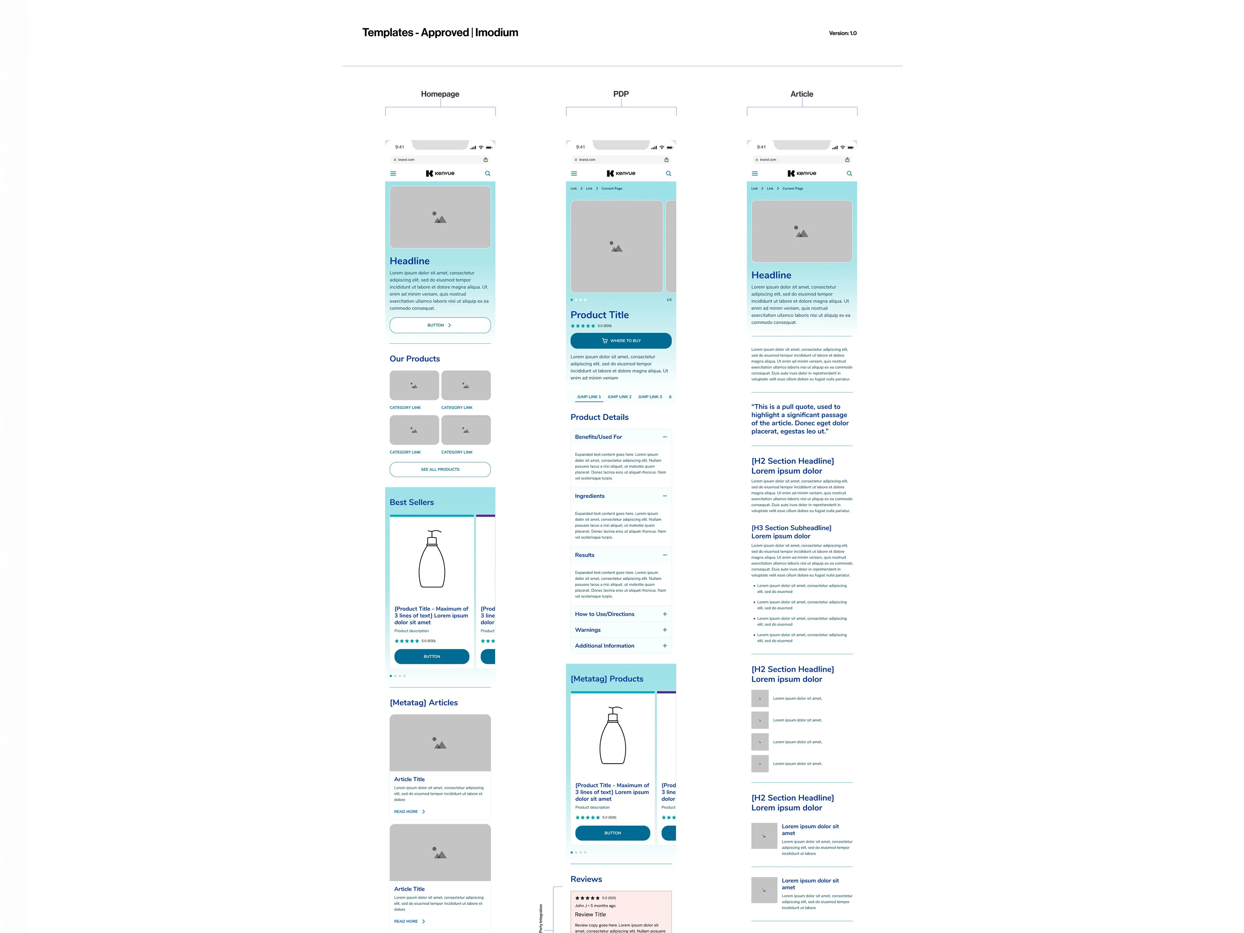
The result is a digital experience that’s clean, accessible and distinctly Imodium.
Outcome
- Launched a refreshed Imodium website on the new DxP, improving both UX and visual design.
- Modernised visuals. Clean typography and softer layout transitions reduce the corporate feel.
- Better accessibility and contrast, especially for CTAs, by refining teal and blue to meet WCAG AA.
- Greater brand consistency through updated typography, layout and imagery. Teal and blue now reflect the packaging across the site.
- A seamless cross-page experience, with new visuals validated on the top templates and most-used page types.
- A flexible foundation for local market rollouts.
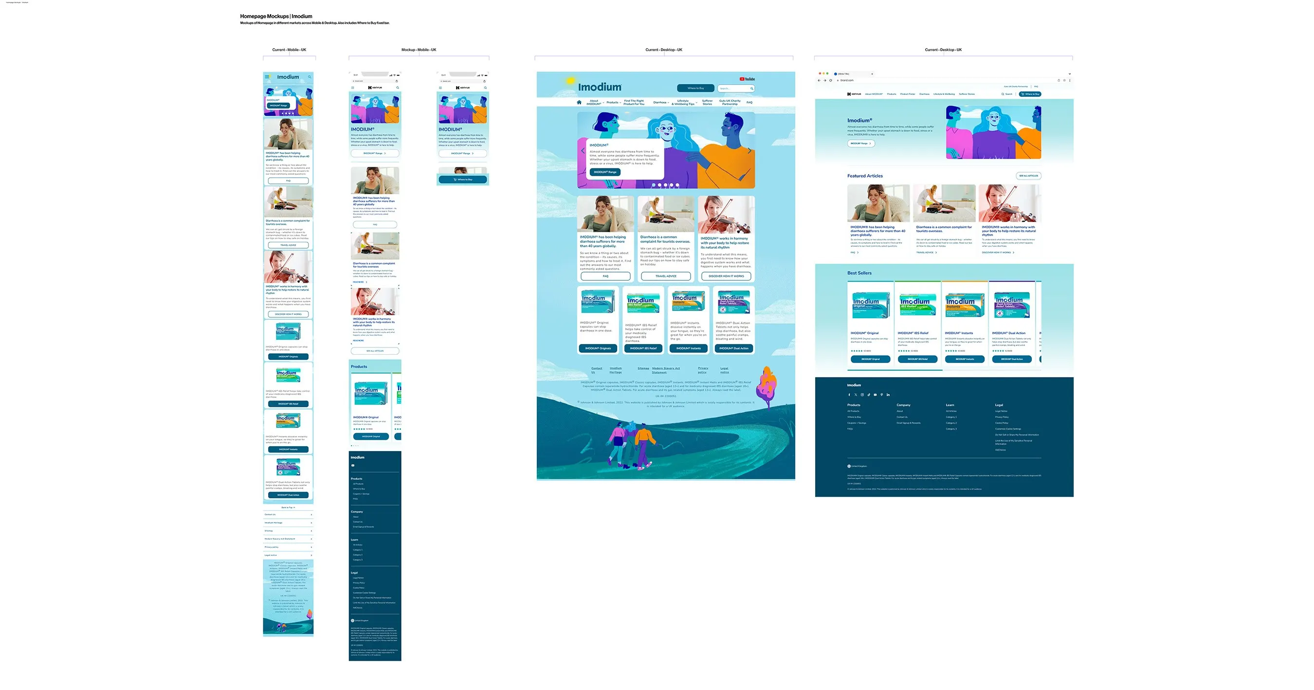
The migration became a chance to refresh and future-proof Imodium’s digital presence, balancing accessibility, modern design and a consistent brand across touchpoints.