The problem
mySorelle was started and led by my wife, Ulrika. The name comes from sorelle, Italian for sisters: we wanted it to carry a sense of sisterhood, of women looking after their own wellbeing together.
The project began with the cycle tracking apps already out there, which in our view had become overloaded: so many features and so much going on that the simple job of tracking your period got lost.
A cycle tracker also holds some of the most personal data a person has: periods, symptoms, moods, private notes. Most trackers ask you to sign up first and keep that history on their servers.
So the idea was to simplify, both in the UX and for the person using it: give women a simple, private and discreet way to track their period, without overcomplicating it and without putting their privacy at risk. No account, no server, no analytics, and no more features than it needs.
My role
Ulrika led the product and the idea behind it. I designed and built it: the spec, UX and UI, the design system, the React Native app, privacy and security, three languages, the App Store and Google Play releases, the website and the promo films.
AI agents, mainly Claude Code, were my engineering, review and QA team. The product decisions stayed with Ulrika and me, and the design and every release call with me.
From prototype to product
The design moved through four tools, each one picking up where the last left off.
- A clickable prototype in Google AI Studio. I started by building the whole app as a working, clickable prototype, so I could click through every flow before designing anything in detail.
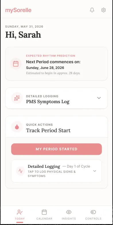
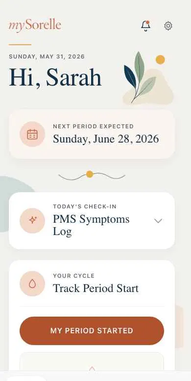
- Into Figma with html.to.design. The plugin brought the prototype’s pages into Figma as editable layers. There I designed the key screens properly, with the design system, type, colour and botanical illustrations.
- Claude Design. I carried on designing in Claude Design, which took the work to a full set of screens and a handover: the design system, tokens, copy and a list of locked decisions.
- Claude Code. The app was built from that handover, one phase of the roadmap at a time.
How I ran it
Before any code, I wrote it all down: a spec, a product requirements document with an id for every requirement, and a roadmap. Four decisions shaped everything:
- One codebase. React Native with Expo, for iOS and Android together.
- Local only. All data lives on the phone. No accounts and no backend of mine, ever.
- The full feature set in version 1, not a cut-down first release.
- Real subscriptions through the app stores, with no card details in the app.
The roadmap then ran the project, phase by phase: foundations, a component kit, the first-run journey, Today, Calendar and logging, Insights, settings, own-cloud backup, subscriptions, languages, polish and accessibility, the website, an independent review and launch. Altogether it took about four months, from the first prototype to a finished app ready for the stores.
Every phase was checked on a real phone, not just a simulator. That rule earned its place: a simulator walk once missed a bottom sheet that could stick half open, and two real phones caught it before release.
I also started with a head start. I’d written down everything PlanJolly taught me as a playbook for the next app, and mySorelle was the first app to use it.
Approach
1. Simple on purpose
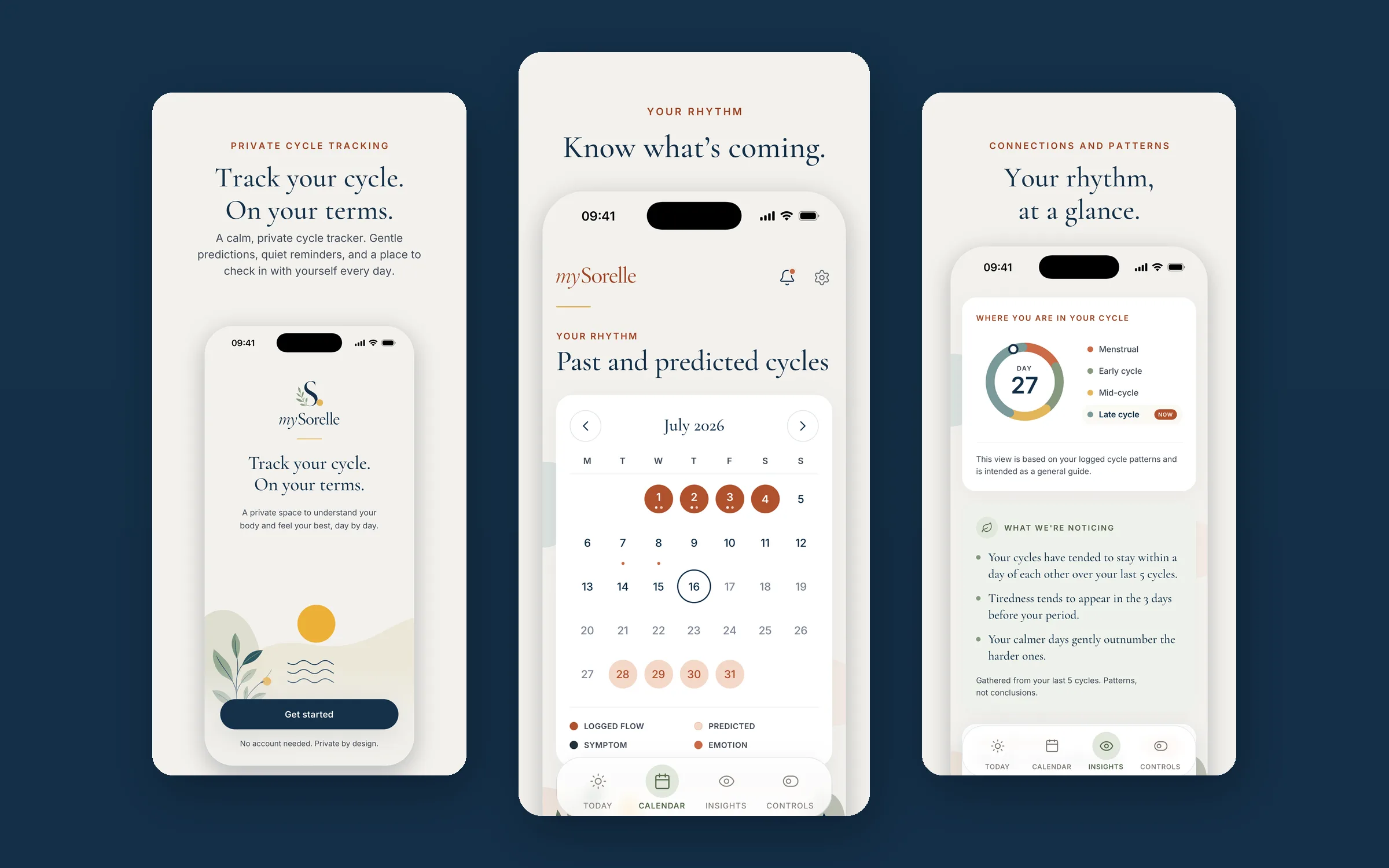
Many cycle apps try to do everything. We went the other way and kept mySorelle to what matters most: knowing when your period is likely, logging it in a few taps, gentle reminders and seeing your own patterns. Every feature had to earn its place, and a lot was left out on purpose: no partner sharing, no fertility guidance, no streaks and no medical advice.
2. Private by design
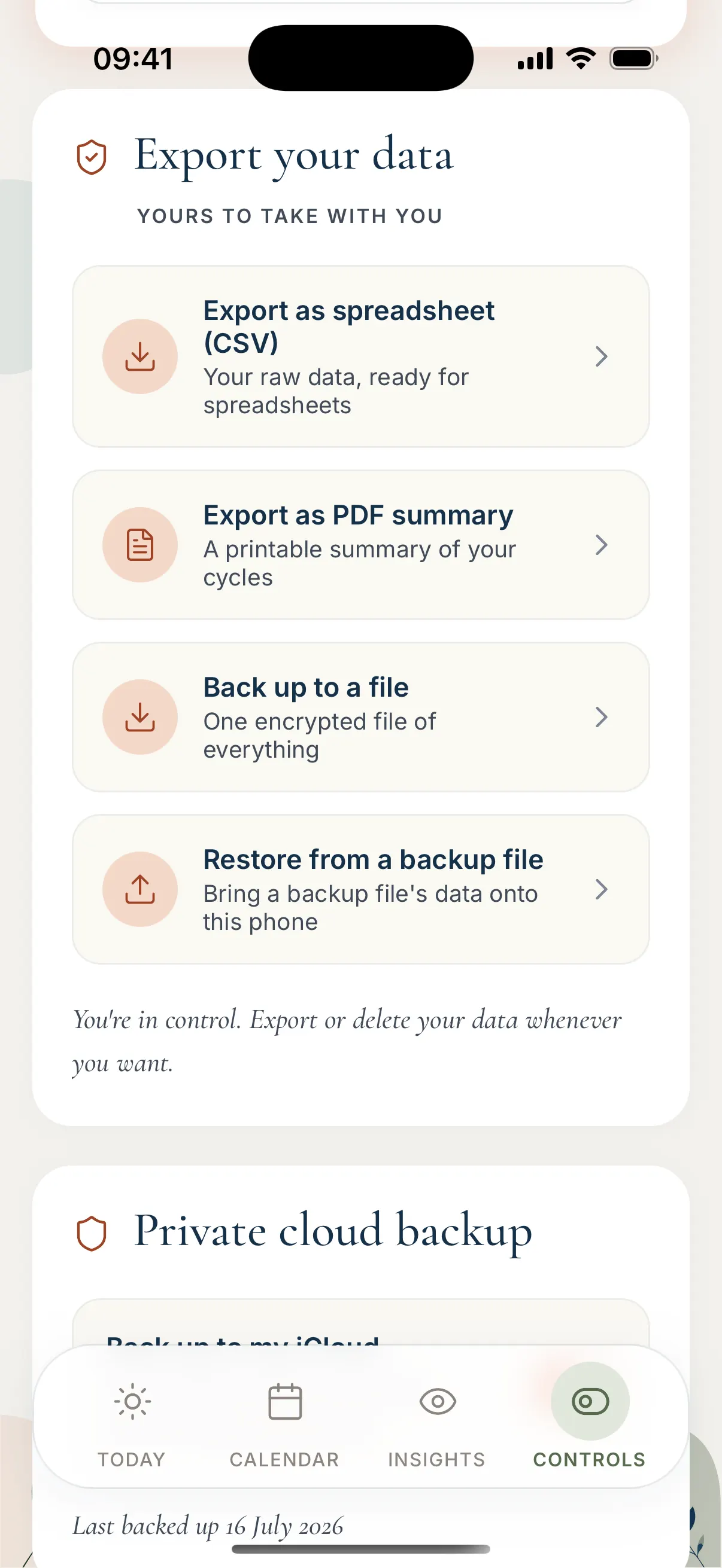
Nothing you log leaves your phone. There’s no account to create and no mySorelle server to send it to. If you want a backup, the app can back up automatically to your own iCloud or Google Drive, encrypted, where only you can reach it. You can export everything as a spreadsheet or a PDF, lock the app with Face ID or a passcode, and delete everything in one go.
3. Calm, not clinical
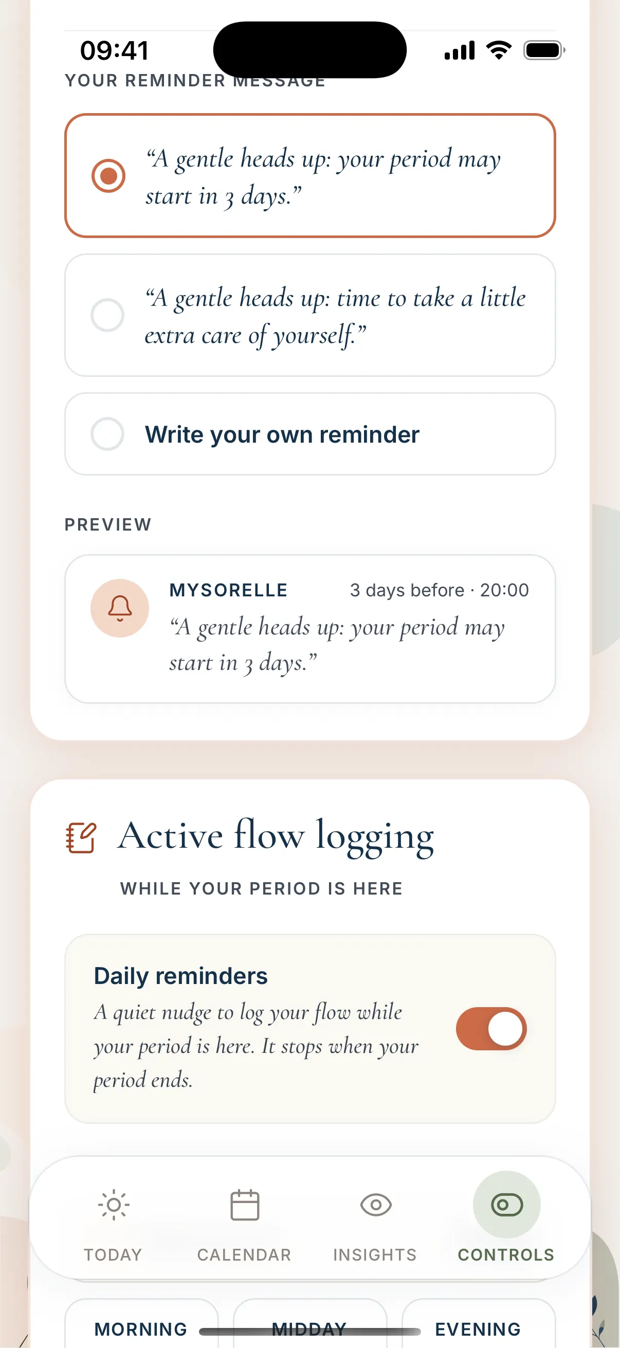
The brand is warm and literary: Cormorant Garamond for display, Inter for everything else, botanical illustrations and three accent themes, Terracotta, Sage and Navy. The voice is warm, second person and shame-free, with no emoji, no streaks and no guilt. Predictions say “likely”, never “will”. The app gives no medical advice.
4. Today, Calendar and Insights
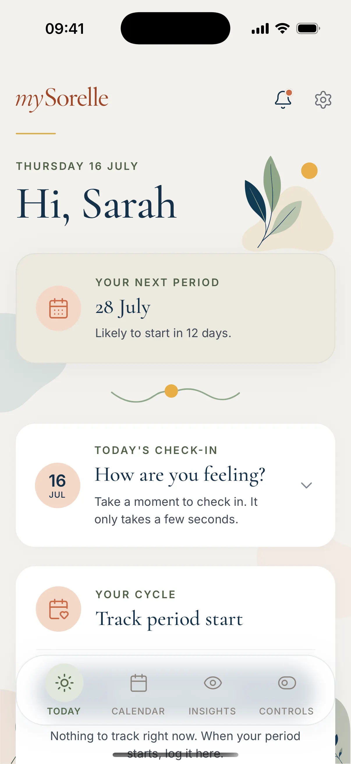
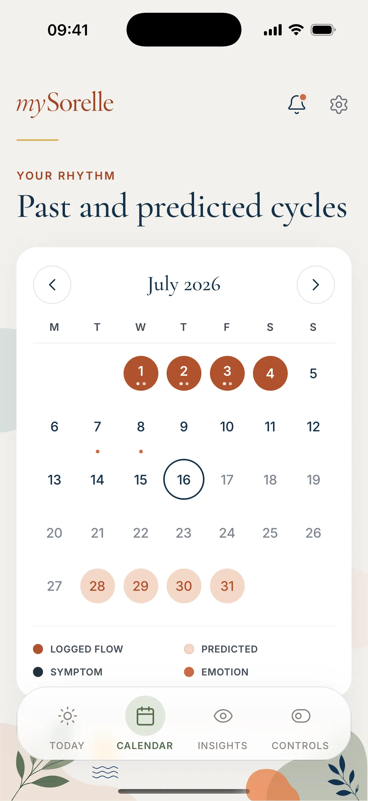
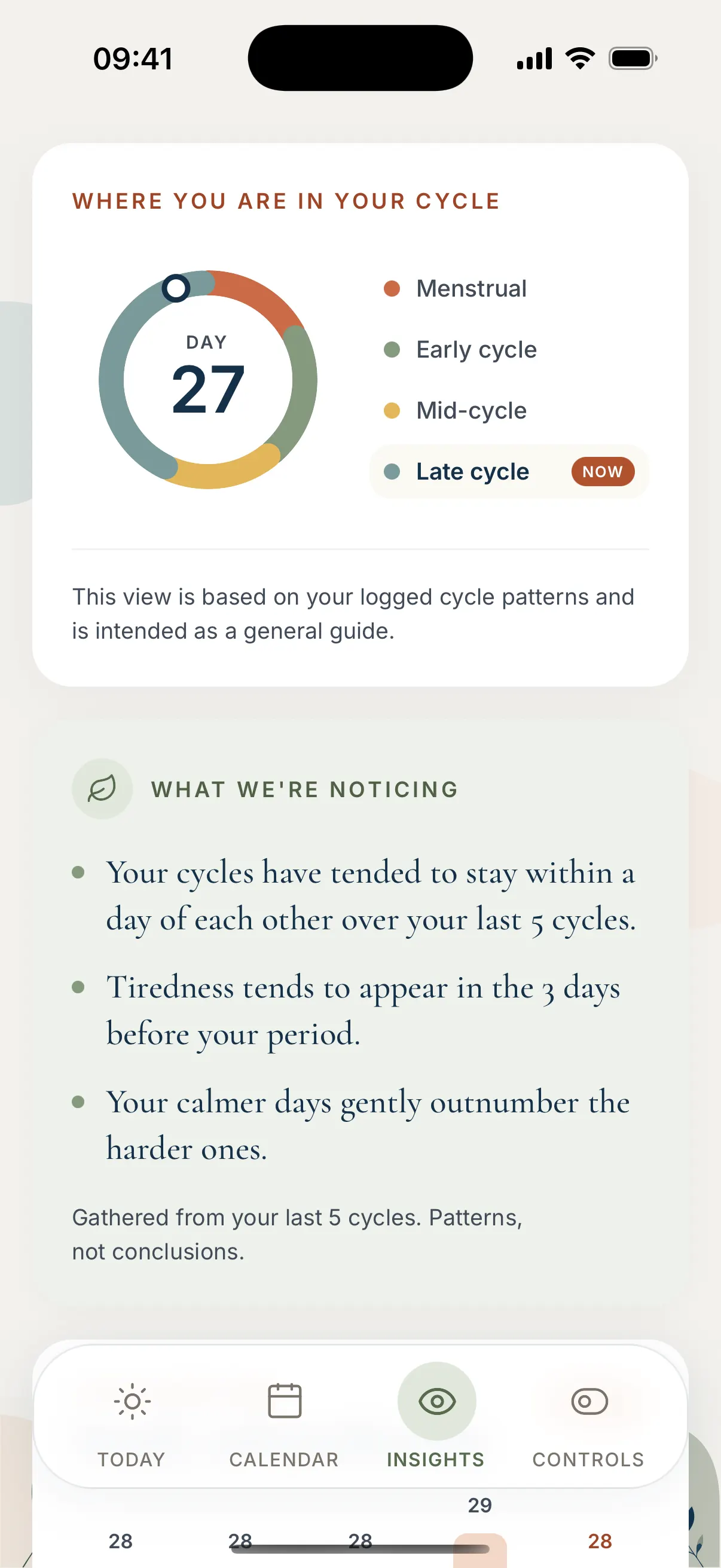
Today is a calm place to check in: your next period, how you’re feeling, and one tap to log a period starting. Calendar shows past and predicted cycles and holds the logging, from flow to symptoms and emotions. Insights shows where you are in your cycle and what the app is noticing in your own logs, framed as patterns, not conclusions.
5. Accessible in every theme
The accent colours are split by job: a bright shade for decoration only, a darker one for text and another for buttons. That way every text and button pairing passes WCAG AA in all three themes, and the split is kept in the design tokens, so screens can’t pick the wrong shade.
6. Three languages at launch
mySorelle launched in English, Swedish and Polish. The translation layer went in on day one, with proper plural rules, since Polish has several plural forms. AI agents drafted the translations, and I reviewed every string myself, as I speak both languages. Headlines and sensitive moments were adapted for feeling, not translated word for word.
Checked before it shipped
For a health app, the privacy promise has to be true, not just written down.
- A first privacy and security audit ran twelve separate review passes, from network traffic and data storage to secrets, billing and store rules. It confirmed the core claim, with no analytics, crash reporting or tracking code anywhere in the app, and the issues it found were fixed.
- An independent review gate before launch. A fresh Claude Code session that had written none of the code tested every claim against the code and the release builds. Its blockers and should-fix items were fixed and re-checked before I submitted to the stores.
Built with AI agents
mySorelle is how I work now: one designer with AI agents, from the first clickable prototype to two app stores.
Launch
mySorelle went live on Google Play in October 2026 and on the App Store on 14 November 2026. Both stores sent it back before approving it. Google’s reviewers couldn’t get past the subscription screen, so I added a private reviewer access code. Apple found a home-screen widget too thin, so I took it out of version 1.
Reflection
PlanJolly taught me the whole route to the app stores. mySorelle let me run it again, faster and with a sharper process: prototype first, design in Figma and Claude Design, then build to a written spec, one phase at a time.
It also changed how I think about simplicity and privacy. Here neither is a setting, they’re the product, and a lot of the design was deciding what the app would never do.
Next for mySorelle: more languages, starting with French, Spanish, Italian and German.