Project overview
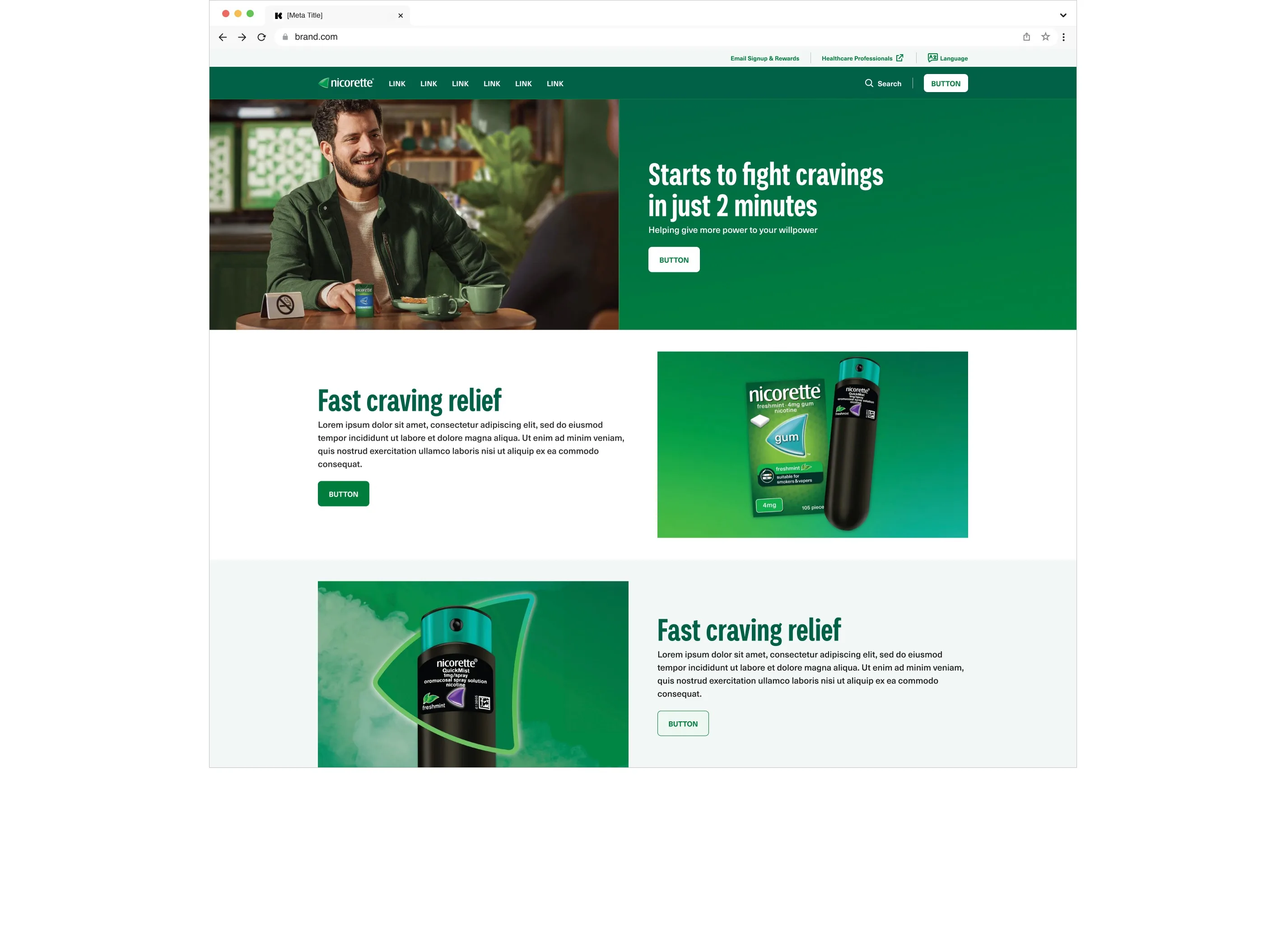
We updated the colour palette, typography, image style and key UI components such as CTAs, and made sure everything worked both online and in print. The result is a cohesive, accessible visual system that is now part of the updated global brand guidelines.
The challenge
Nicorette’s digital palette looked dated and didn’t meet accessibility requirements, especially for primary CTAs and body text on brand colours like yellow and green. Many combinations failed WCAG AA contrast, which made critical interactions hard to read or act on. The brand also looked different across its 40+ global websites, with variations in colour, typography and tone.
Typography needed a refresh too. The existing scale wasn’t flexible across languages such as German and Japanese, and wasn’t built for digital interfaces. We wanted to keep the brand’s recognisable tone while introducing a more modern, scalable type system. That included moving from all-caps headlines to sentence case, for better readability and a more approachable tone.
There was a broader challenge as well: keeping the evolving brand and digital product design aligned. The goal was a system that works across platforms, bridging print and packaging with digital products, and feeding a complete, platform-agnostic global brand book.
Nicorette’s mission is deeply personal: helping people take control of their health. The digital presence needed the same clarity, calm and strength.
Goals and approach
- Refresh the digital brand while keeping Nicorette’s core identity, its logo and key visuals.
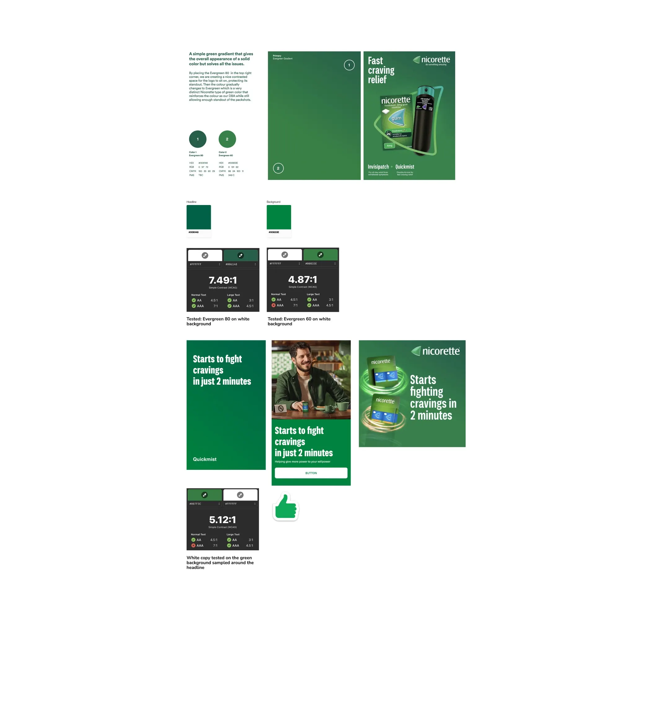
- Improve the colour palette and gradients to meet WCAG AA.
- Apply and test the colours in real templates using the design system.
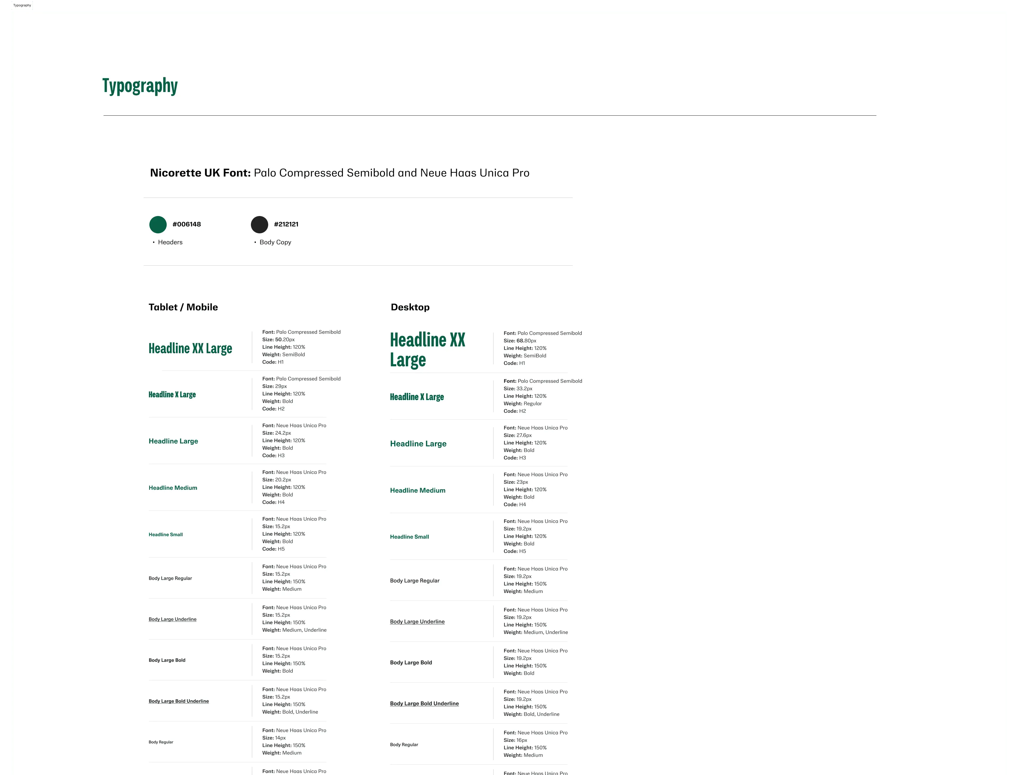
- Introduce a scalable, accessible type hierarchy, tested across breakpoints and languages.
- Update layouts, backgrounds, component styling and visual assets, such as the Nicorette spinnaker.
Design execution
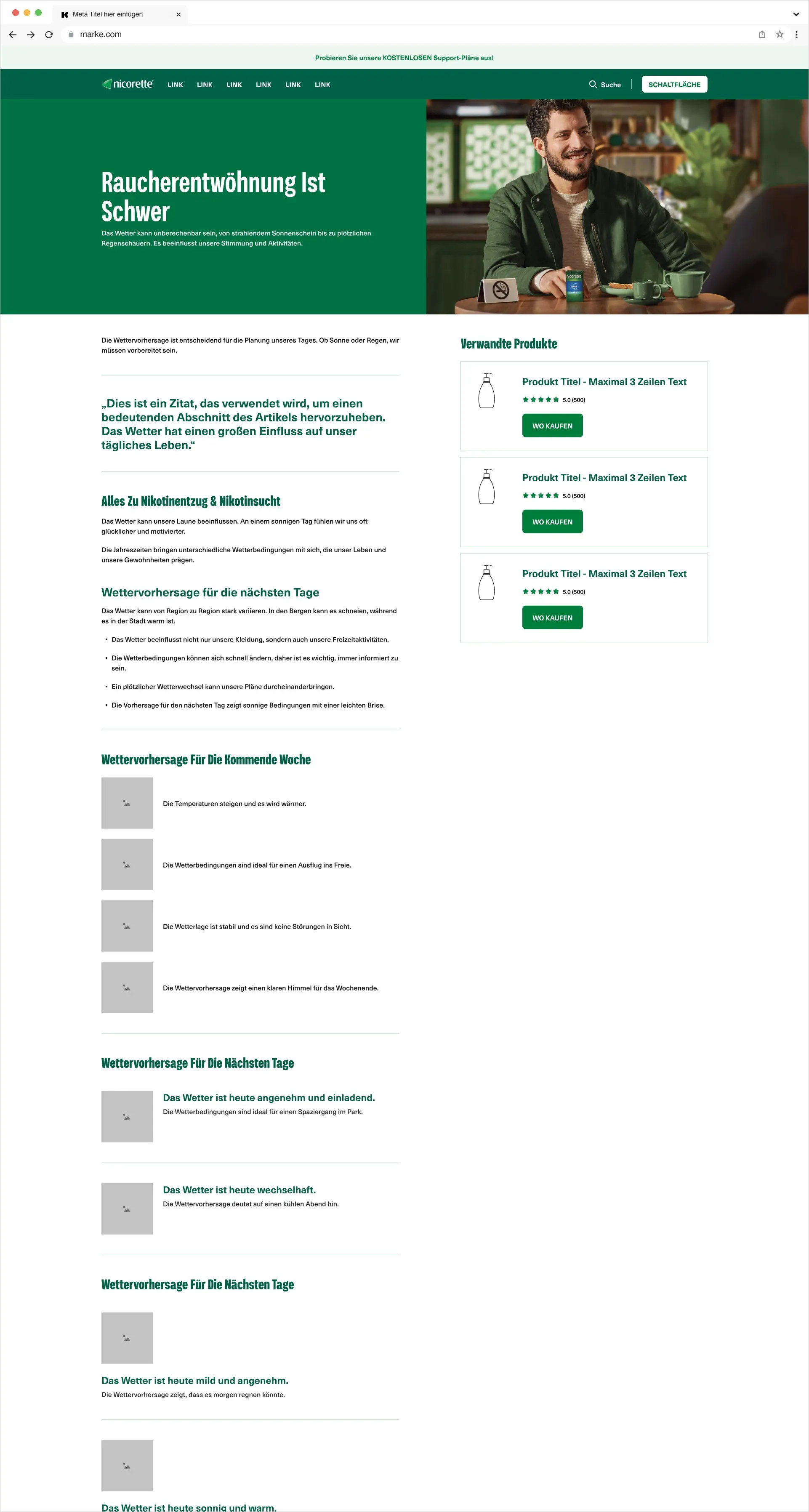
We applied the new palette and typography directly to themed Nicorette templates in the global Kenvue design system, to test performance and accessibility. Gradients and CTA colours were checked with WCAG AA tools and adjusted in context until they passed.
Typography was implemented across a range of breakpoints and languages to check flexibility and balance. We dropped all-caps styling in favour of sentence case for a clearer, friendlier tone.
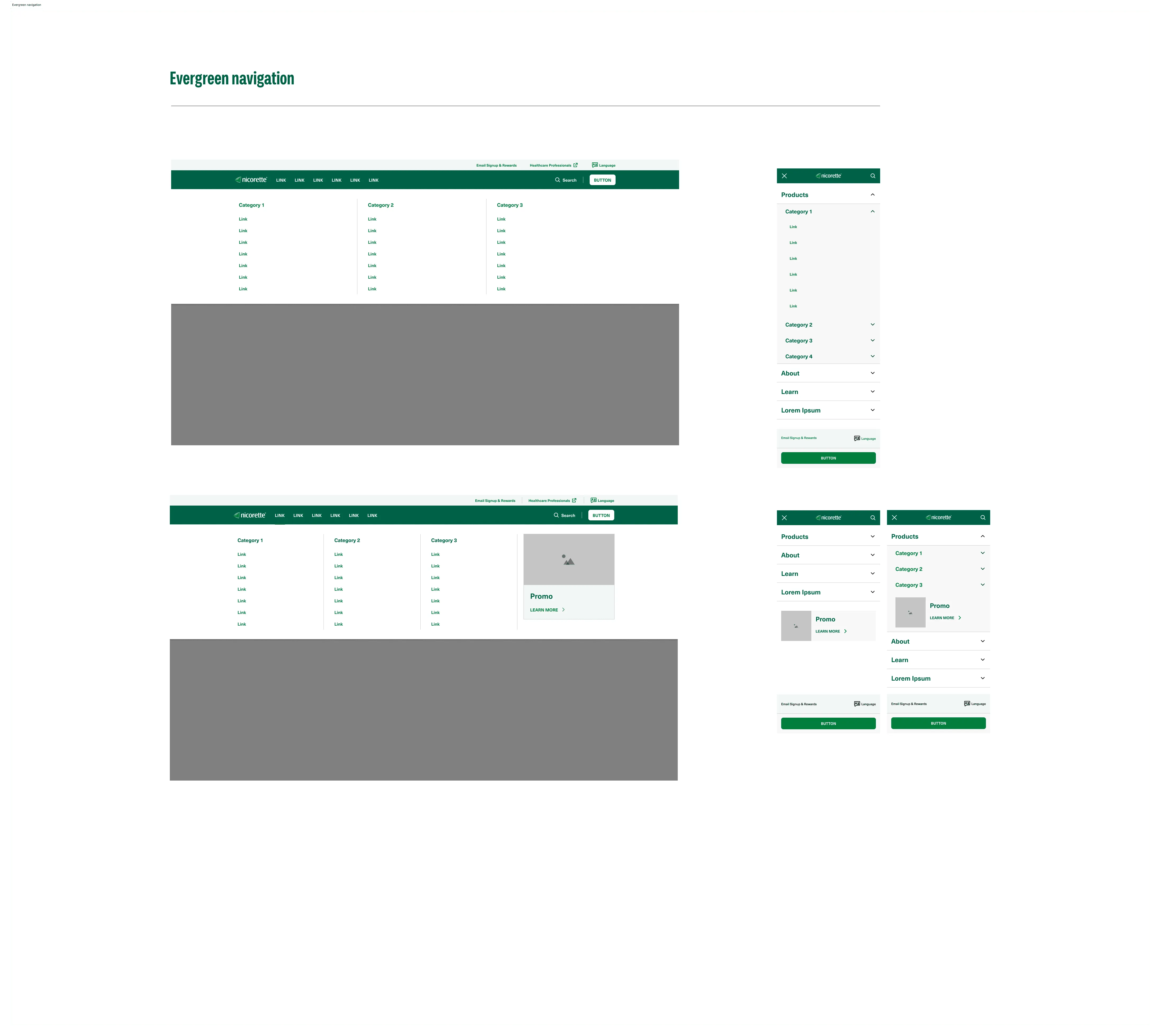
We also refined common components such as buttons, hero banners and section backgrounds to match the refreshed brand. Working with brand and development teams kept the implementation accurate and the handover into the final guidelines smooth.
Outcome
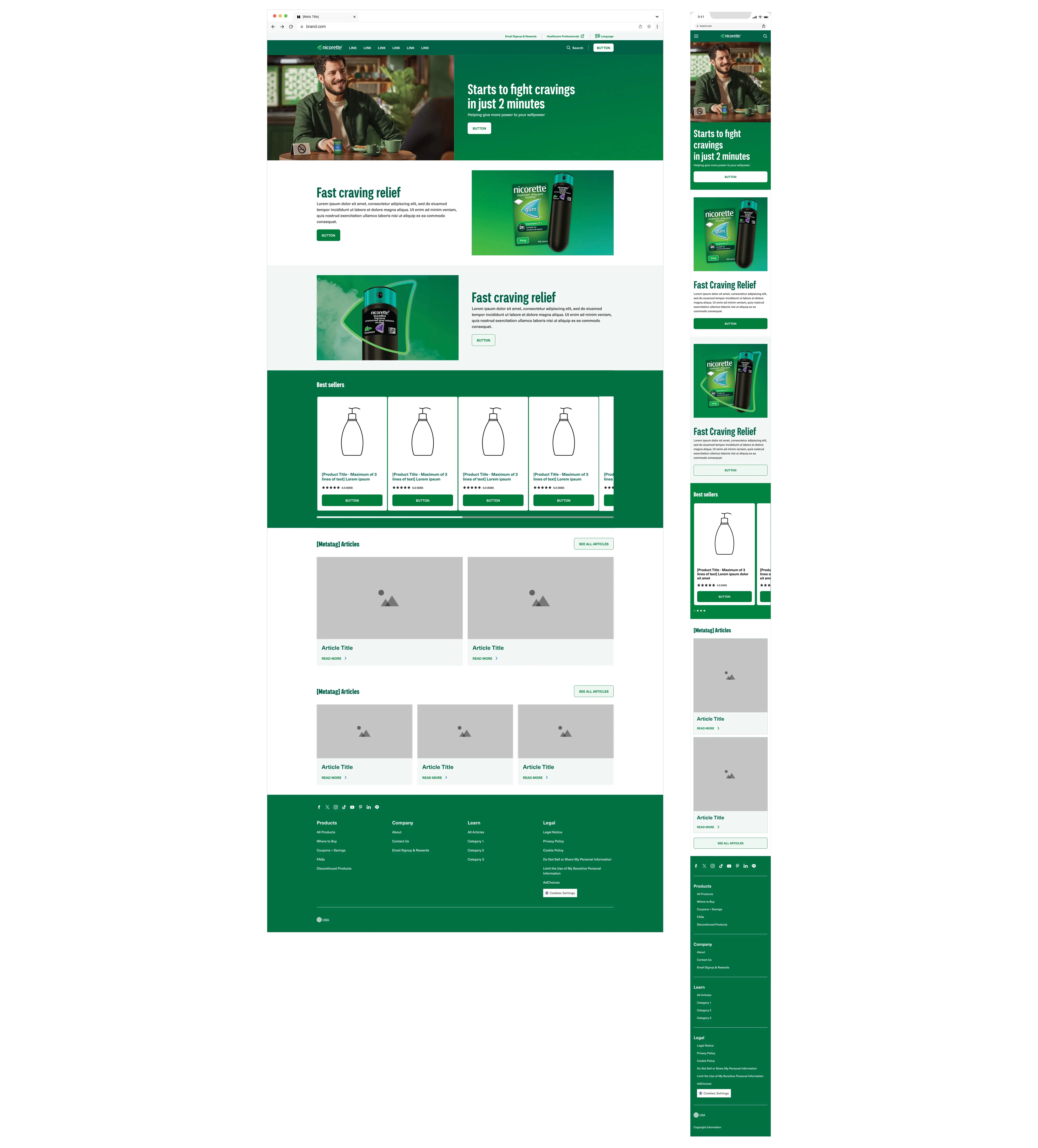
The refreshed digital brand improved accessibility and consistency across Nicorette’s presence in 40+ markets. The new colours, typography and components went into the design system, with the design tokens updated to match.
The rollout is ongoing, with local brand teams adapting existing assets such as banners, imagery and layout templates.
The new design brings better accessibility, stronger brand recognition and a more unified experience across digital and offline channels. Stakeholder feedback has been very positive, and the framework keeps supporting rollout worldwide.
It was rewarding to see a trusted health brand reborn with a modern, accessible interface, knowing the work supports real people on their health journeys.